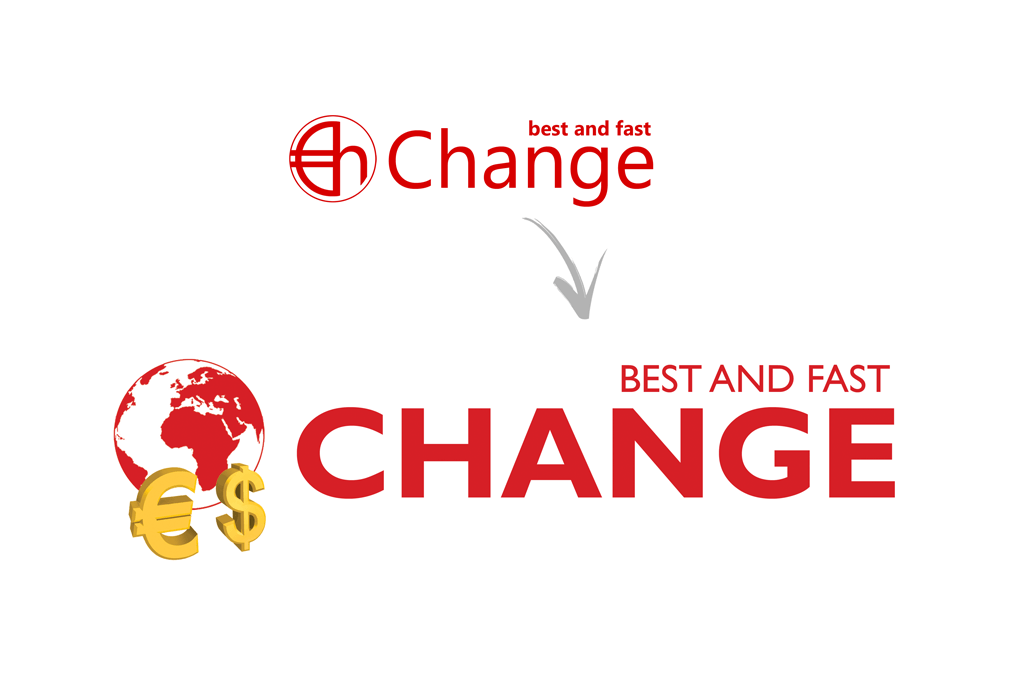
The renewal of the company logo is due to the growth and expansion recently joined by Best and Fast Change.
While retaining the company’s colors, white and red, Best and Fast Change has changed the graphics, consequence of a “reset” priority of values, highlighting particularly the aspect of human relations, “the share exchange ratio is first and foremost a human and exchange relationship”.
The concept of “internationalization” and expansion abroad is expressed by the image of the planet, which is an ever-changing world, both cultural and economic, just as the slogan declares: The change, in a changing world. This reflects how the company is perfectly in step with the times, as regards the economy and the use of technologies in the services as well.
Tribute to this vision is the decision to include two currencies, dollar and euro, which are at the center of the daily transactions in our branches.


